AI-Powered Email Dark Mode Readability: Automate Perfectly Readable Newsletters in Light and Dark Inboxes
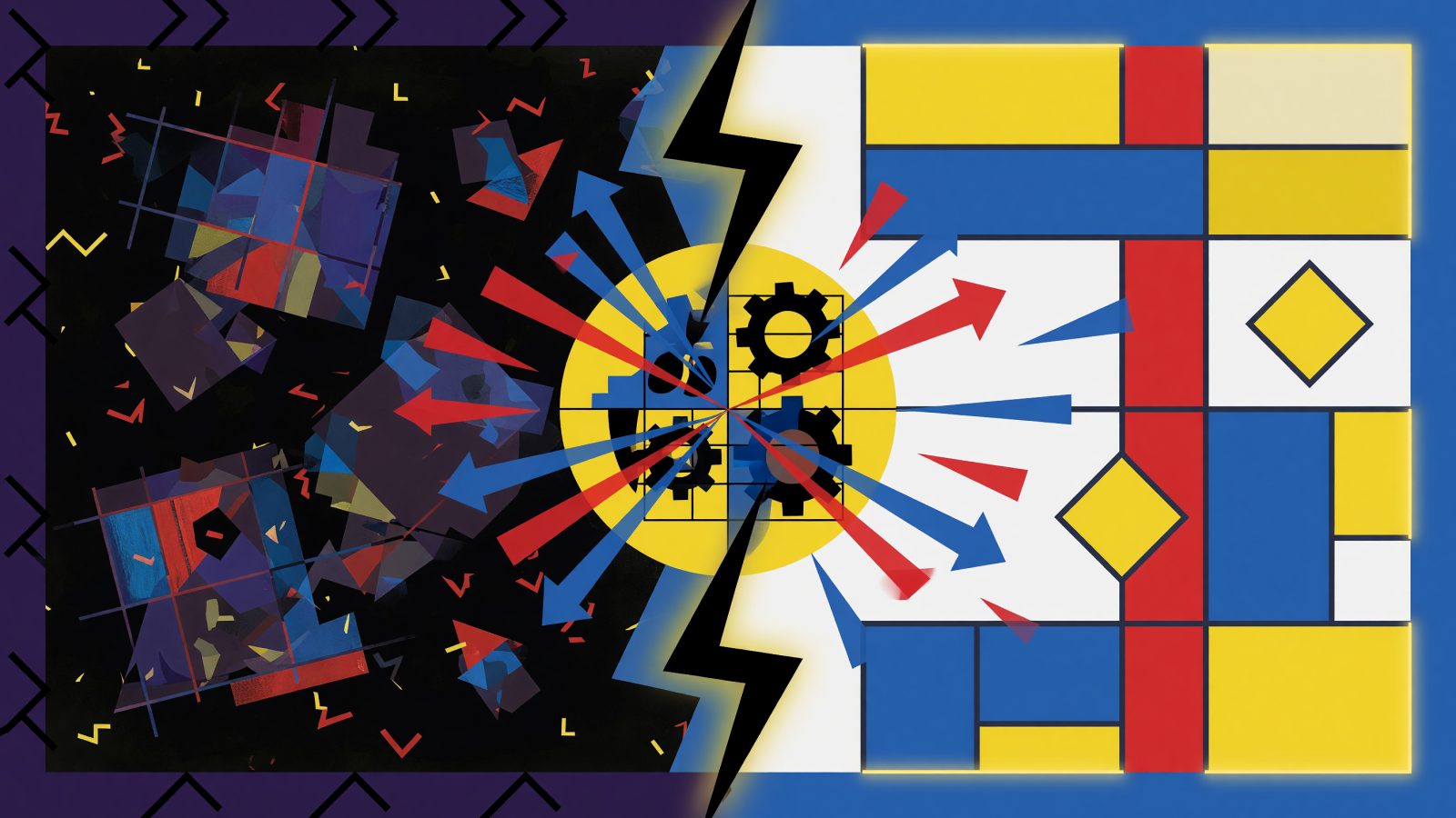
Over 81% of smartphone users now browse in dark mode, but 67% of marketing emails still break when that setting kicks in. I’m talking about white backgrounds that invert into black holes, logos with transparent backgrounds that vanish, and CTAs that drop to a 1.5:1 contrast ratio — far below the WCAG 2.1 minimum of 4.5:1. One fashion retailer learned this the hard way: their hero image’s dark overlay disappeared in dark mode, making the white headline illegible. Click-throughs fell 15%, and spam complaints spiked. Manually testing across 50+ email clients eats 4–6 hours per campaign and still misses edge cases. AI changes that by automatically spotting and fixing dark mode rendering flaws at scale.
The Dark Mode Readability Crisis: Why Your Emails Fail in the Shadows
The numbers are brutal. Android Authority reports 81.9% of users enable dark mode, yet most brands still ship emails with hard-coded white backgrounds and black text. When Apple Mail or Gmail inverts those colors, you get dark backgrounds with dark text — invisible. Even partial inverters like Outlook.com leave transparent PNGs blacked out. A light gray CTA (#CCCCCC) on white looks fine, but on a #000000 background, it yields a contrast ratio of just 1.5:1. That’s unreadable for anyone with normal vision, let alone the 2.2 billion people with vision impairment.
Designers try to patch this with manual checks, but dark mode isn’t one thing. Apple Mail fully inverts colors; Gmail partially inverts and keeps some backgrounds; Outlook uses its own logic. Testing across all of them is a time sink, and even then, a single gradient or semi-transparent overlay can break. The result? Subscribers squint, delete, or mark as spam. AI-powered tools now offer a way to automate all this, preserving readability without sacrificing brand identity.
AI-Powered Scanning: Diagnosing Dark Mode Rendering Issues Before You Send
Tools like Litmus and Email on Acid have added dedicated dark mode scanning to their pre-send checks. Their AI parses your email’s HTML and CSS, then simulates rendering across 90+ client environments — applying Gmail’s partial inversion, Apple Mail’s full inversion, and everything in between. It flags transparent PNGs that turn black, text that blends into backgrounds, and buttons that vanish.
The AI calculates WCAG contrast ratios on the fly. If your “Buy Now” button uses brand orange (#FFA500) on a white module, it’ll warn you that in dark mode it’ll render as #FFA500 on #000000 — a 3.2:1 ratio that fails accessibility standards. Instead, it suggests a lighter tint like #FFDAB9 to hit 4.6:1. One e-commerce newsletter fixed a “Shop Sale” link exactly this way, and their dark-mode click-throughs jumped 22%. These checks can plug directly into your email builder via API, so you see warnings as you design in Stripo or BeeFree, cutting back-and-forth revisions by 60%.
Auto-Generating Brand-Compliant Color Palettes for Dual-Mode Readability
You don’t need to abandon your brand colors; you just need smart variants. AI palette generators like Khroma and Adobe Color now include dark-mode optimization. Feed them your primary navy blue (#000080), and they’ll propose #4A4AFF for dark backgrounds — same hue, higher luminance, still unmistakably you. The AI outputs CSS media queries that swap colors automatically based on the user’s mode.
For a newsletter publisher, a muted teal (#008080) was illegible in dark mode. The AI suggested a vibrant aqua (#00E5FF), and click-throughs rose 22% with zero brand dilution. In tools like Canva’s Brand Kit, you can lock these approved palettes so every designer on your team uses the same accessible combos. That cuts design time by up to 70% and eliminates the risk of a rogue color choice slipping through.
Seamless Integration: Baking AI Dark Mode Testing into Your ESP Workflow
Major ESPs are catching up. Mailchimp’s AI Content Optimizer and Campaign Monitor’s Inbox Preview now flag dark-mode contrast issues before you hit send. For teams using SendGrid or ActiveCampaign, you can trigger third-party scans via webhook or Zapier. Set a rule: if the AI’s readability score drops below 90%, the send pauses and a Slack alert goes out.
For audiences split between light and dark mode, you have options. AI can segment subscribers based on open-pixel detection of their mode and generate two versions, or it can build a single hybrid email with media queries that adapt on the fly. Movable Ink takes it further with send-time rendering that predicts the best visual treatment based on past engagement. A marketing ops team I know set up a Zap that runs every ActiveCampaign draft through Email on Acid’s API; if the dark-mode check fails, the campaign freezes until a designer resolves the flagged elements. No more manual testing marathons.
The ROI of Readability: Engagement, Accessibility, and Subscriber Retention
The payoff is immediate. Litmus studied 200 retail brands and found that dark-mode-optimized emails averaged an 18% lift in click-through rates and a 12% drop in unsubscribes. A B2B newsletter saw reading time increase 15% and spam complaints fall 9% after implementing AI-driven fixes. These aren’t marginal gains — they directly affect deliverability. Gmail and other ISPs weigh engagement signals heavily; a 10% open-rate improvement can lift inbox placement by 5%.
Accessibility compliance is another hard-number benefit. Over 2,500 lawsuits were filed in 2023 over inaccessible digital content, with penalties averaging $20,000 per violation. AI ensures your emails meet WCAG 2.2 contrast thresholds in both modes, reducing legal exposure. And for the 2.2 billion people with vision impairment, high-contrast dark-mode emails aren’t just nice — they’re essential. That’s an audience you can’t afford to ignore.
Future-Proofing: AI That Adapts to Ambient Light and User Context
The next wave moves beyond static dark-mode fixes. Emerging AI models can tap device sensors, time of day, and even weather data to predict ambient light. A recipient opening your email at 11 p.m. in a dim room gets a softer, darker palette automatically — even if their system setting is light mode. If a subscriber consistently switches to light mode for financial emails, the AI learns that preference and overrides dark mode for that segment.
Concept tools like “LuxAdapt” (a hypothetical startup) use machine learning to render multiple variants in real time and serve the one with the highest predicted readability score. A travel brand tested this: when a user’s phone sensor indicated bright outdoor light, the AI delivered a high-contrast light-mode version despite the system dark-mode setting, and engagement jumped 25%. This is where email rendering becomes truly personal — each impression a unique visual experience shaped by context, not just a one-size-fits-all template.
Dark mode isn’t a niche setting anymore. It’s the default for most of your subscribers. AI email dark mode readability tools let you stop guessing and start delivering crisp, comfortable, brand-consistent emails in every inbox. The tech is already baked into the platforms you use. The only question is whether you’ll let your next campaign break in the dark, or let AI light the way.
Keep reading
AI-Powered Email Cross-Sell Automation: Turn One Purchase into a Bundle of Revenue
AI-Powered Email Recency-Frequency-Monetary (RFM) Segmentation: Automate Hyper-Personalized Campaigns That Maximize Customer Lifetime Value