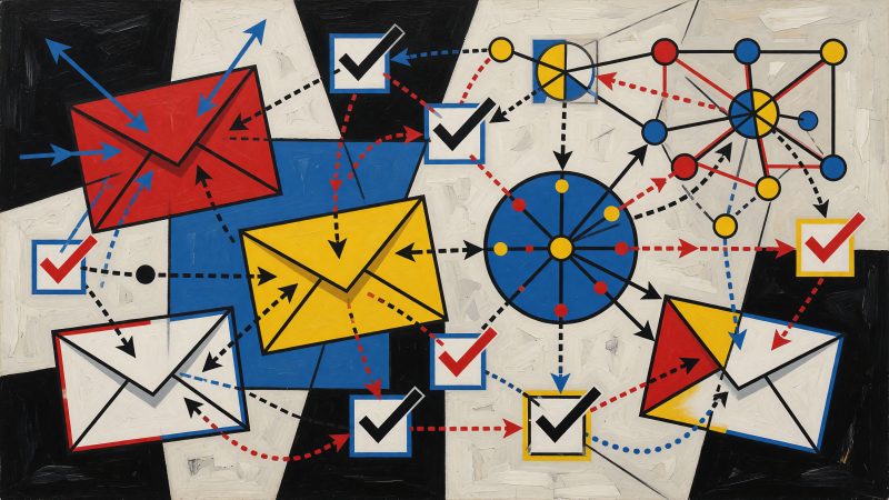
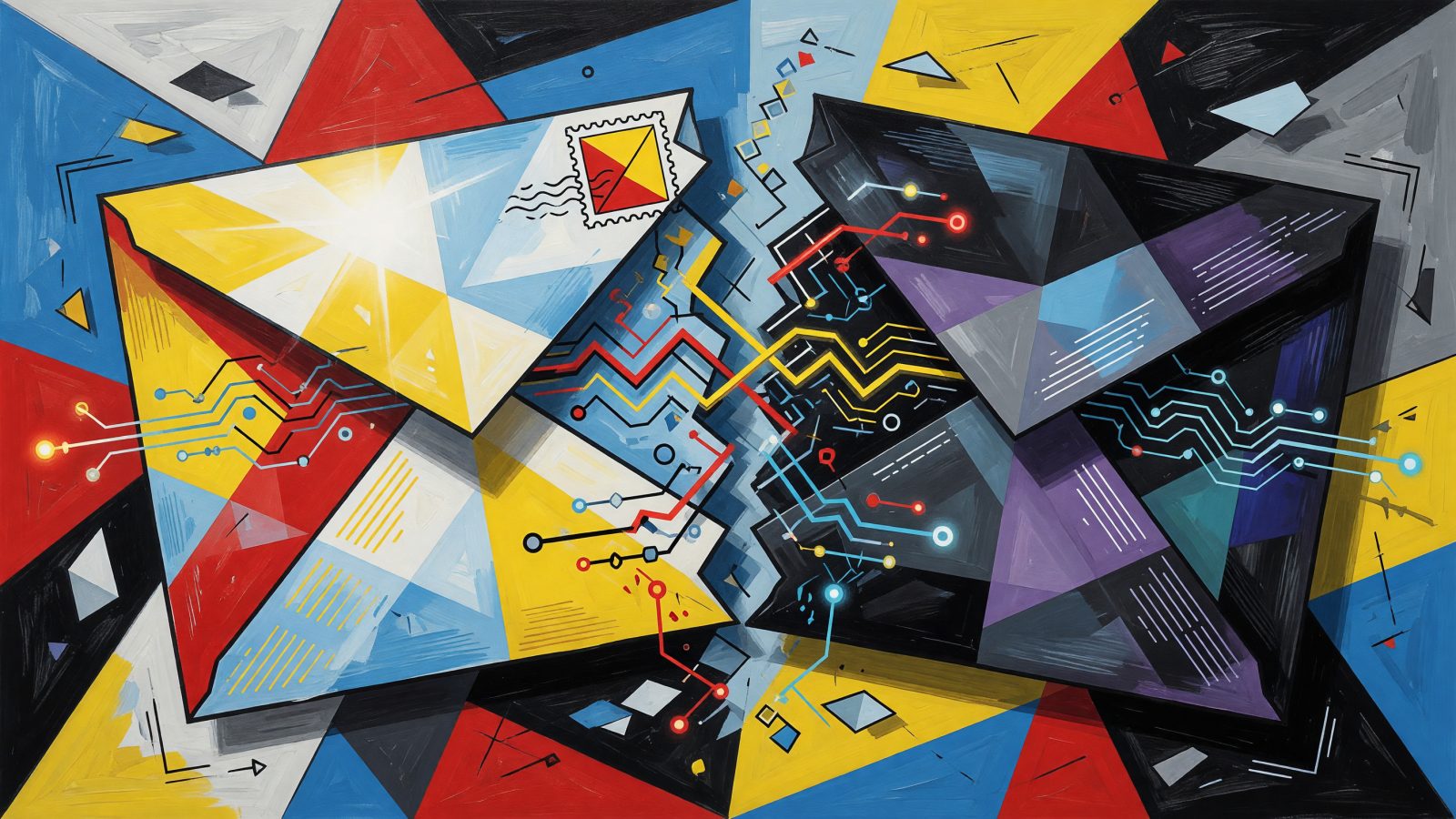
AI-Powered Email Dark Mode Optimization: Ensure Your Newsletters Shine in Every Inbox
You fire off a campaign that took three rounds of design review. The hero image pops, the CTA button is perfectly placed. Then 35% of your subscribers open it in dark mode. Your white logo? Vanishes. That deep navy CTA? Turns jet black on a charcoal background. Clicks plummet. Worse, 12% of those people hit unsubscribe. Dark mode isn’t a design preference anymore — it’s a deliverability and trust problem. And manually testing every email across 30+ dark mode client variations is a fast track to burnout. That’s where ai email dark mode optimization steps in, using machine vision and auto-generated code to stop the breakage before you hit send.
Why Dark Mode Is a Non-Negotiable for Modern Email Marketing
Over 80% of smartphone users now keep dark mode enabled system-wide, according to a 2023 Android Authority survey. Litmus data from 2024 pegs the share of email opens happening in dark environments at 35% and climbing. If your emails don’t render cleanly in that mode, you’re actively repelling a third of your audience.
The stakes go beyond aesthetics. An Email on Acid study found that broken dark mode rendering — inverted colors, invisible text, missing brand marks — correlates with a 12% spike in unsubscribe rates. Recipients don’t debug your HTML; they just leave. And many email clients (especially Apple Mail with iOS) apply full color inversion that can turn a carefully chosen palette into an accessibility nightmare. When your CTA becomes #000000 on a #1a1a1a background, nobody’s clicking.
Brand trust takes a direct hit. A subscriber who sees a neon-green version of your logo or a white block where a button should be starts questioning whether they signed up for a legitimate business. You can’t afford to treat dark mode as an edge case. It’s the default for millions, and a single broken send can tank engagement metrics that inbox providers use to decide if your next campaign lands in the primary tab.
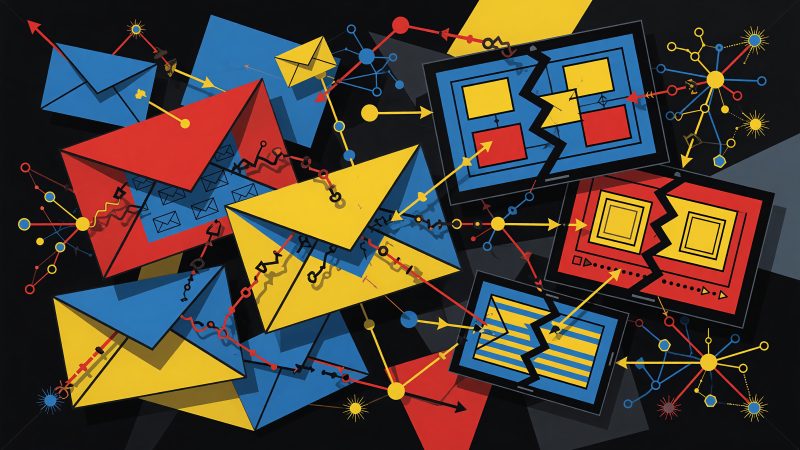
The Core Challenges of Dark Mode Rendering in Emails
Three rendering strategies dominate email clients, and each breaks your design in a different way. Apple Mail on iOS applies full color inversion: light backgrounds become dark, dark text becomes light, and it even flips some image colors. Outlook.com uses partial inversion, leaving background colors alone but lightening dark text, which often results in white-on-white disasters. Then you’ve got webmail clients like Gmail on desktop that respect your CSS but strip @media (prefers-color-scheme: dark) rules unless you jump through hoops. One email, three completely different outcomes.
The most common casualties? Transparent PNGs. A white logo on a transparent background disappears entirely when Apple Mail inverts the surrounding canvas to #1c1c1c. A black logo on transparency becomes a ghostly white smear that blends into mid-tone backgrounds. CSS background colors set on table cells get removed by Outlook’s partial inversion, turning a cozy #F5F5F5 section into stark white. And any hex code you’ve hard-coded into a button or headline is fair game for the inversion algorithm — often dropping contrast ratios below the WCAG minimum of 4.5:1.
Manual testing turns into a time sink. You’d need to mock up your email in Litmus or Email on Acid, manually flip between light and dark previews for 15+ clients, then write custom media queries and Outlook-specific [data-ogsc] hacks. For an SMB marketer sending weekly newsletters, that’s half a day gone — and you’ll still miss edge cases like the new Samsung Email client update that changed how it handles inline SVG fill colors.
How AI-Powered Tools Automate Dark Mode Optimization
Modern email testing platforms now bake computer vision and code-generation models directly into dark mode workflows. Tools like Parcel, Litmus, and Email on Acid offer AI-driven rendering engines that don’t just show you a dark mode screenshot — they flag the exact pixels that’ll cause problems and auto-generate fixes.
The detection side works like a visual QA specialist that never sleeps. After you upload your HTML or connect your ESP via API, the AI renders your email across a matrix of dark-mode clients. A convolutional neural network scans each screenshot, comparing light and dark versions to detect color inversions. It builds a heatmap where red overlays highlight areas with insufficient contrast, missing logos, or inverted brand assets. Litmus’s engine, for instance, can spot that your #FFFFFF button became #000000 and give it a severity score so you fix the most damaging issues first.
The real power is in the auto-correction. Parcel’s Dark Mode Assistant automatically writes @media (prefers-color-scheme: dark) blocks to lock your brand colors. For Outlook, it injects [data-ogsc] CSS selectors that prevent partial inversion from washing out your text. If your white logo is on a transparent PNG, the AI can generate an inline SVG replacement or suggest wrapping it in a div with a forced dark background. One marketer I talked to stopped spending four hours per campaign on dark mode patches after connecting Klaviyo to Parcel’s API. Pre-send checks now block any campaign with contrast failures, and the AI’s suggested code snippets get applied in two clicks.
Integration with ESPs turns this into a safety net. Mailchimp and Klaviyo both support webhooks that trigger an AI dark mode audit before a campaign is sent. If the checker finds critical breakage, it can pause the send and notify you with the exact CSS to paste into your template. No more discovering that your biggest promo of the month was illegible to 20,000 subscribers.
Step-by-Step: Using AI to Bulletproof Your Email Designs
Here’s the practical flow I’ve seen SMB teams adopt in about 30 minutes per campaign:
-
Render across dark mode clients in one click. Drop your HTML into Litmus Builder or Parcel.io’s dark mode testing suite. Connect your ESP so the AI pulls the live version. It’ll render simultaneously on Apple Mail dark, Outlook dark, and Gmail dark — no manual toggling.
-
Review the AI heatmap and severity scores. The interface shows a red-yellow-green overlay on your email. A red patch over your hero image means the algorithm detected contrast below 3:1. Click it, and the tool shows the before/after pixel values. You prioritize the red items; everything else is a nice-to-have.
-
Accept auto-generated patches. For Apple Mail, the AI will propose a media query like:
@media (prefers-color-scheme: dark) {
  .cta-button { background-color: #4A90E2 !important; color: #FFFFFF !important; }
}
For Outlook, it inserts
[data-ogsc]rules to target the inverted state. One click applies these to your template. -
Validate contrast ratios automatically. Tools like the Stark plugin (built into some email builders) use AI to scan text and UI elements against a dark background, flagging anything below 4.5:1. No more squinting at a color picker.
-
A/B test the optimized version. Within your ESP, send 20% of your list the dark-mode-patched email and 20% the original, then use the AI analytics in Litmus to compare CTR and conversion lifts. I’ve seen teams pick up a 9% click increase just by fixing invisible buttons.
Best Practices for AI-Assisted Dark Mode Design That Converts
Start with a dark-mode-first asset strategy. Provide your AI tool with a white-on-dark logo variant (no transparency) and define your brand colors as CSS custom properties. When the AI generates media queries, it can swap variables cleanly without breaking specificity. Services like Khroma use neural networks to suggest accessible color pairs — feed it your primary hex and it returns dark mode complements that hold 7:1 contrast.
Add a manual fallback link. A tiny “View in light mode” button in your footer acts as a safety valve. Track clicks with UTM parameters, and let your AI platform tally how many people tap it. Over time, you’ll identify segments that hate dark mode and can suppress dark-specific optimizations for them.
Personalization loops are the next frontier. If a subscriber has opened your last six campaigns in dark mode (data most ESPs expose via their API), your sending logic can serve them a version with deeper blacks and dimmed accent colors to reduce eye strain. A small ecommerce brand I work with uses this approach and saw a 14% drop in dark-mode-related complaints.
Finally, set up AI monitoring alerts. Email clients update constantly. A new release of Outlook or Gmail can change how they handle your carefully crafted dark mode CSS. Tools like Email on Acid’s monitoring dashboard will re-render your stored templates after each client update and ping you if something breaks. That turns a reactive fire drill into a 30-second weekly check.
Dark mode isn’t a trend — it’s the default for a huge chunk of your list. Letting AI do the heavy lifting of previewing, detecting, and auto-patching keeps your brand from bleeding subscribers over something as fixable as an inverted logo. Start with a test on your next three campaigns, compare the unsubscribe rates, and you’ll see exactly why ai email dark mode optimization pays for itself in a single send.